CAUSE : AI Chatbot

About the Company

The Shareholder Association for Research & Education (SHARE) is a Canadian leader in responsible investment services, research, and education for institutional investors.

Objectives:

Improve overall aesthetic and user experience and to make the site more engaging

Improve overall aesthetic and user experience and to make the site more engaging
Improve overall aesthetic and user experience and to make the site more engaging

Improve overall aesthetic and user experience and to make the site more engaging

Phase 1

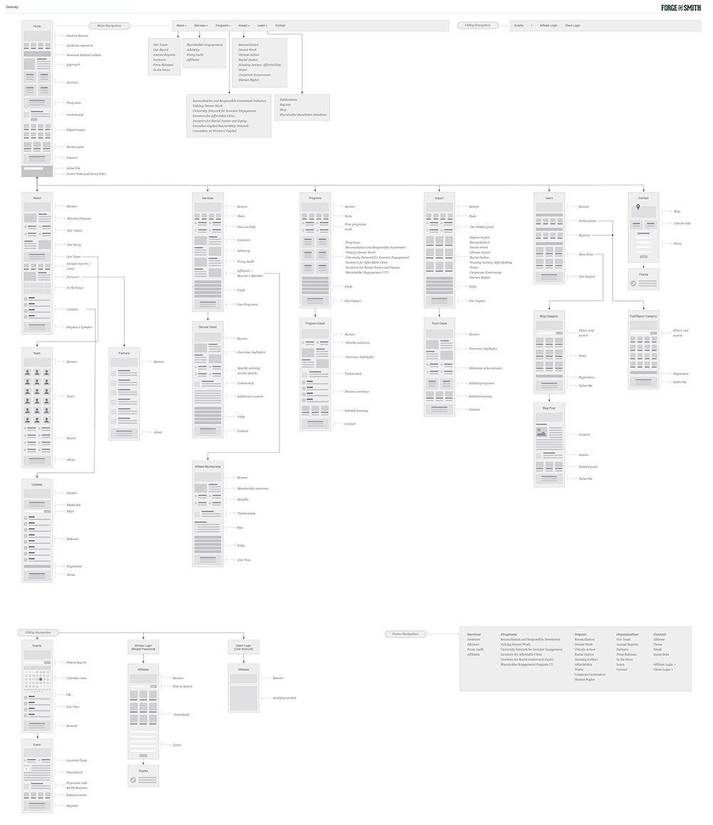
Prototyping

A few years before contacting us, SHARE had gone through a rebrand including a shift in their services. Their site was just not reflecting who they are, what they do, and the impact they have. They needed a full website redesign.

The big focus for this project was to create a more multifaceted approach to their offering, helping visitors explore their work through a more storytelling style using initiatives and impact rather than straight-up services. Our goal was to provide a deeper content experience, and with better overall structure to help that content get discovered.

Phase 2

Style

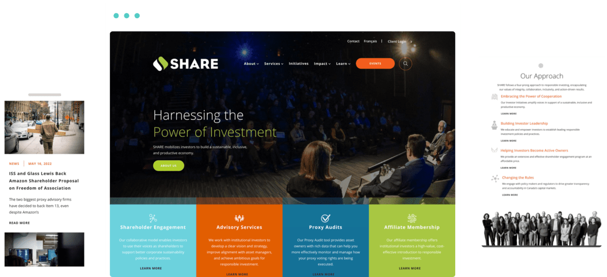
A large part of SHARE’s new design was updating the look and feel of their content for a more modern and professional aesthetic. This included utilizing both dark and white space for a striking contrast, and vivid orange accents to lead the eye to navigation, key information, and conversion points.

Phase 3

Bringing it All Together

The new SHARE site captures the professional energy and high quality service of their brand. Visitors can view the scope of their work from the services themselves, as well as their initiatives, impact, and educational resources. The project was so successful that we will be working with SHARE’s team again on two more websites.